5 tips for styling the letters in your Type Co


The Little Type Co is by far one of our faves. This giant letter board for your wall is meant for expressing life’s moments – the wittier the better in our opinion.
Here are a few tips we have specifically for how to style the letters on the ledges.
- Anchor your quote with the number of words that will fit on each ledge.
- Decide on the formatting and alignment. Which lines will need to be all the way left aligned or centred. Use the screws to help!
- Form the words and move around to create emphasis on certain parts.
- Play with letter spacing to make it easier to read. Space out the letters slightly so no letter is touching.
- Stand back and look for words that need a tiny shuffle.
Whether you have the small fonts (Gatsby or Farmhouse) or you have the Large set the letters are best when slightly spaced apart.
The Little Type Co will give you exactly what you need to become a clever wordsmith with your home decor. Will you use your Little Type Co. set to make people laugh, think deeply, or groan? The possibilities are endless!


Share and tag us using your Little Type Co @littlewstudio or use the hashtag #littletypeco with how you style your set. We love hearing from you!
-Christin
1 Response
Leave a comment
Also in Little w Notes

How to pick plants for your home decor

Launch a sense of inspiration with new Little Type Co sets
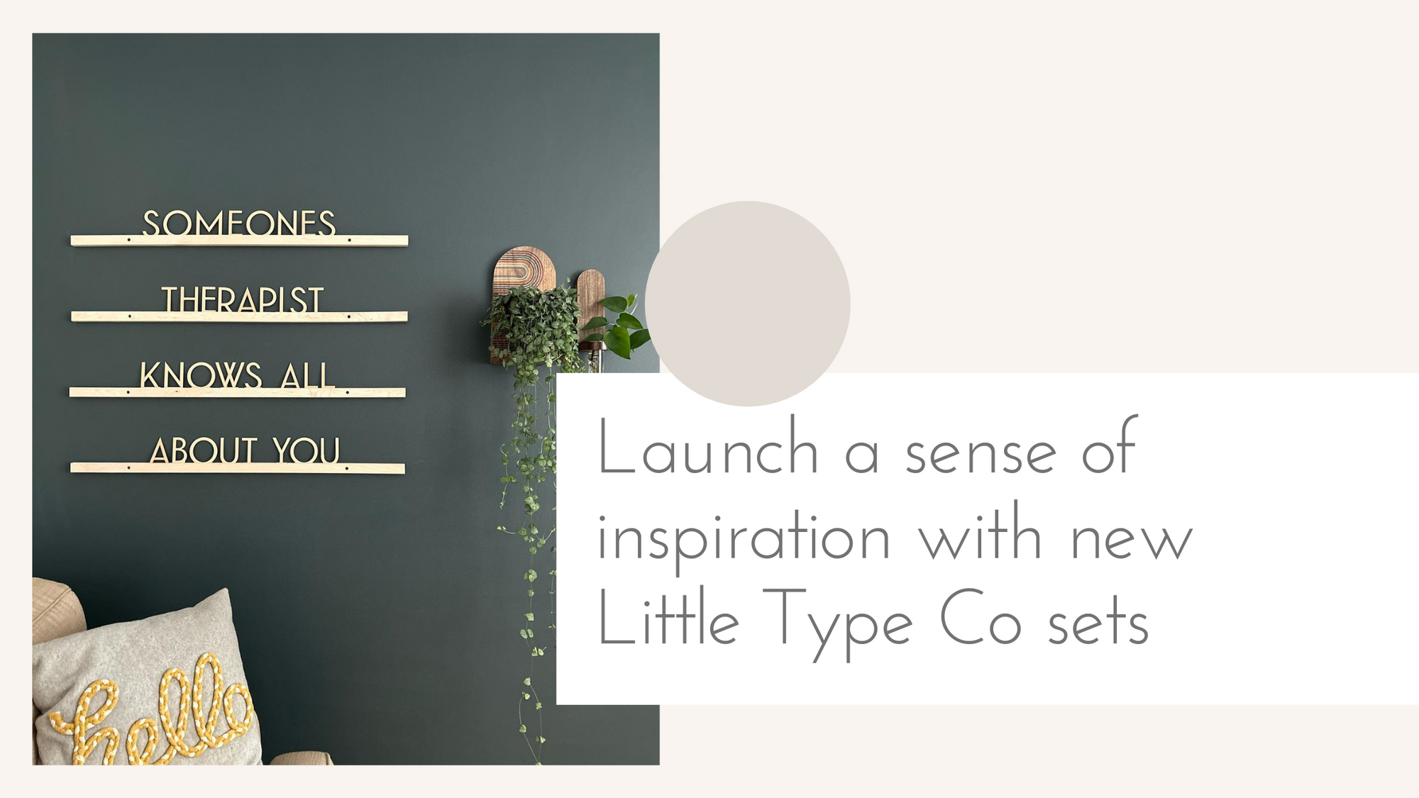
You asked and we answered! The Little Type Co collection is growing! The giant letter board for your wall has two new natural wood sets now available! The new unfinished wood sets come in our Farmhouse and Gatsby fonts.

ROKIPEDIA
November 12, 2020
To be honest your article is informative and very helpful. After i saw your site and i read it and it help me a lot. Thanks for share your kind information. You may like this post on https://rokipedia.net/how-to-improve-my-handwriting/